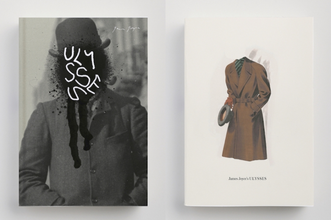

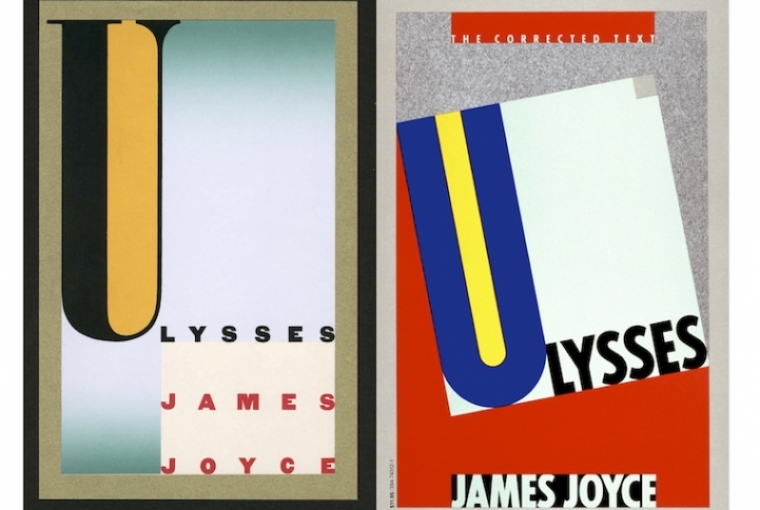
L-R:Process sketch and Final Book Cover by Carin Goldberg
My childhood fantasy was to own a bookshop and to be honest, I still harbor that dream. As I walk by my favourite bookstores all over the world (even in countries I do not speak the language), I long to be the glamorous owner in those cozy spaces, sometimes behind the counter and other times chatting with my customers, looking at the vast expanse of tightly packed shelves with pride, and contentment.
While that fantasy has yet to come to pass, I did manage to figure out a way to be surrounded by books, and be an important part of creating the visual stories (within which the real stories reside) that have drawn me in since I started to read as a child.
I became a book designer!
When I started my career in NYC at a small design studio, books were always part of what we designed and invariably (possibly because my bosses sensed my giddy enthusiasm whenever a book project came in) I would be the one designing that cover or coffee table book. It dawned on me very early on that my heart lifted at the sight of a 6 x 9 format, and that books were what made me happiest.
By the time I finally went to work at a publishing house (Little, Brown and Company) as an Art Director, I had developed my own system of how to approach a cover. Every designer has their methods, and mine was to read the book from end to end, figure out what imagery, or lines in the text had caught my attention and then sketch out covers that were far from literal, but somehow piqued my fancy or brought a funny, wise, obscurely intelligent, or simply whimsical (take your pick) perspective to the book. I actively shyed away from the “make it beautiful for beauty’s sake” school of design, not that I didn’t like beautiful…I always thought books deserved more than just a pretty cover.
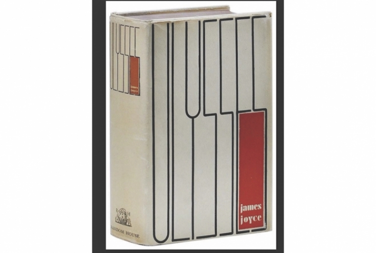
Book cover by Ernst Reichel (1933)
I was lucky enough to be part of a publishing house that had a rich archive of books from its past, and a hefty back list (Evelyn Waugh, Salinger, Forester, Thomas Pynchon amongst others) that gave me the opportunity to design the entire set of re -issues of some of these greats. My favourite being the series of 14 paperbacks and one hardcover of Evelyn Waugh that I redesigned with the brilliant illustrator Bill Brown. The pleasure (and pain) of redesigning a book that was published decades ago, and continues to stay in print, is that there is the excitement and the optimism of making ones own mark on the history of the book, for a new audience, in the context of the time that one was working in, and also the pressure of knowing that quite possibly someone else, some great book designer of the past, has done it better!
Personally, I have collected multiple copies of a book based purely on the covers (as my 14 copies of Pride and Prejudice bear witness) which reinforces my belief that just because it was designed beautifully and seemingly perfectly once doesn’t mean that one shouldn’t attempt something new.
I find it fascinating to see the evolution of a great cover for new audiences over time, and have always wondered if (like myself) the designers of those classics found it exhilarating and intimidating in equal parts.
I decided to find out and picked the grand classic Ulysses by James Joyce as the book whose cover has been redesigned multiple times, and whose place in history is undisputed (whether or not one has actually read it or pretended to read it).
The book was first published in 1920 amidst much controversy (for obscenity) and banned in the USA for the next 14 years. Shakespeare and Company issued the first book jacket for it in 1922 -simple and clean! In 1933 Random House acquired the rights for the US edition and it’s first iconic cover was designed by Ernst Reichl. Henry Matisse designed a limited edition illustrated edition in 1935, and on it went…being re-issued and re-designed many times over the past 85 years.
Two of the most stellar book designers in the world (and my absolute inspirations) Carin Goldberg and Peter Mendulsund have also designed their versions of this classic. I asked them to shed some light about their process and inspiration.
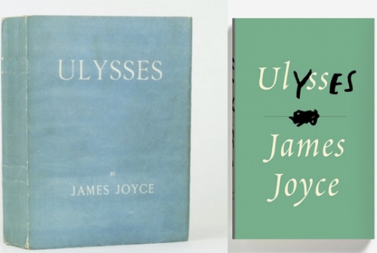
L-R: Original book cover (1922) and Final Book Cover by Peter Mendulsund
Carin Goldberg. The grande Dame of book design, winner of the AIGA gold medal, record cover designer extraordinaire. She designed the Vintage Books version in 1986.
Which older version did you admire, buy or remember?
I was asked to leap off from the Edward McKnight Kauffer Ulysses cover from the 1950’s that uses the letter U as the focus of the overall cover design. I love all the pervious Ulysses covers.
Have you read it?
Given the very specific art direction I received from Vintage there was no need to read the book. The wink/suggestion to Modernism was what we were exclusively aiming for - style, not the content, similar to the previous covers.
Do you feel that great covers need to be redesigned for a newer audience?
Yes. Most should be redesigned so a younger generation of readers can relate to the graphics that represent them. When I redesigned all of Kurt Vonnegut's books in the 1980’s I designed them with high school and college students in mind. That series got enormous attention and put Vonnegut on the map again. The design became iconic and represents a specific time and generation of Vonnegut readers.
Peter Mendulsund. Definitively the best book designer of our generation, former concert pianist, writer and general design genius. Peter designed the cover in 2013 for Powerhouse books.
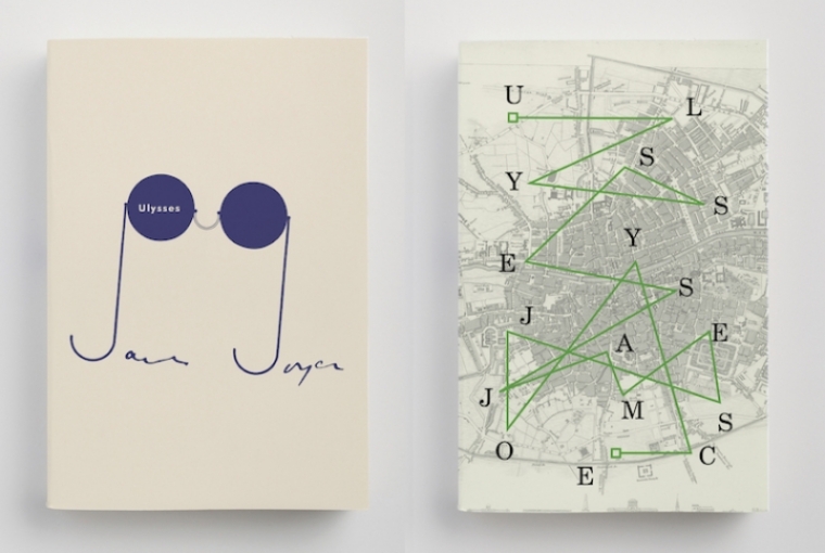
Book Cover explorations by Peter Mendulsund
Which older version did you admire, buy or remember?
The first version of Ulysses I read was in college: it was a Vintage Books paperback, the corrected edition. The cover was Carin Goldberg’s. I still own that copy, and it is covered with my notes and basically unreadable now. Since then, I’ve acquired almost all of the other English language editions, including a first edition (which I found in a used book sale for $200!) The main hole in my collection is the special edition, which Matisse illustrated. I get the sense that this particular edition will always sit outside of my price range.
Have you read it?
Four times.
What was your thought process (briefly) while designing your version?
The book is extremely important to me, so, mostly, I wanted to be as respectful to the text as possible. This usually means making a cover, which performs as little design as possible, to make a cover which didn’t get in the way of the reading experience. Though, I still wanted to assert something important about this seminal text. Seeing that “yes” embedded in the title was one of my more memorable (and favorite) moments as a cover designer, and that insight enabled me to make a minimalist cover which still communicated something vital.
Do you feel that great covers need to be redesigned for a newer audience?
I’m not sure, honestly. I can say that I’m glad these books are redesigned, as it gives me ample opportunities to re-design them!
I realized that both these talents had approached it completely differently, and yet each one had created something timeless and iconic. Carin inspired by an earlier cover, Peter inspired by Carin, and of course the words itself….
And therein lies the beauty of the creative mind, we all do it differently, we all see an aspect of the story that another doesn’t, we bring to it our own quirks, education, influences and we all distill our view into these covers that will live on. They will entice some browser into becoming a reader, or tempt an owner of that particular book to buy yet another copy, just for the sheer joy of having that cover live on their shelves.
Now, I must pick up my copy of Ulysses and get reading!!!!

RYMN MASSAND