
Visual communicator, art director, educator, design strategist, and publisher, Bonita Vaz-Shimray lends us some insight into the artistry behind editorial design.
The Designer
I wanted an adventure in the creative arts but was clueless where to begin. Back in the 90s, we had little choice when it came to readymade garments, and I was forced to become adept at pattern making and sewing. So, at sixteen, fashion design seemed like a promising career option. A relative knew a neighbour who was studying at the NID, Ahmedabad, and persuaded me to give it a shot. I didn’t realise the possibilities until I got selected and found myself on campus for the interview. From there on, it was a lot of unlearning and a whole new journey. The student graduate shows were eye opening, and by the end of the foundation year, I was drawn to the world of graphic design.
Editorial Design
I think it’s imperative for a book cover to stay true to the book while being clear on its positioning — the cover after all has to connect the book to the intended reader. It is the very first engagement a potential reader will have with the book, so it must intrigue or appeal or say pick-me-up in a few seconds of browsing. Standing out against the clutter on a bookshelf means it needs to be able to draw one’s attention from afar and live up to expectations when held close. The design, typesetting and production are critical in the book coming together as a whole.
Working for HarperCollins India allows my work to flow across a very diverse range of books, from commercial to literary fiction, non-fiction and children’s books. The best part is that I get to collaborate with creative individuals across the industry. Rejacketing the backlist is a refreshing challenge because the books are familiar, which allows covers to be more experimental. For the Harper Perennial translation series, we made use of calligraphic letterforms from the original language to creature a textural motif designed by Studio Em and Em. Also, the Khushwant Singh series that was playful in its exploration of Indian matchbox art.
The Influences
First, my design gurus in college — the late Vikas Satwalekar, the late Suresh Immanuel and Mahendrabhai — who were not only design visionaries but exemplary mentors, and set the tone for a creative temperament that required commitment, passion and discipline, while always keeping an open mind. Bauhaus designer El Lissitzky and his Russian book-cover art and avant-garde use of minimalist geometric forms. Paula Scher for her use of type as image, and her bold and clear messaging — she’s one of the most influential graphic designers and one who has managed to stay relevant. Zuzana Licko’s Emigre font foundry with their versatile collection of type — there was a time when I was obsessed with Mrs Eaves, a contemporary take on the transitional serif Baskerville (and named after John Baskerville’s wife and muse Sarah Eaves).
Favourite Book Covers
Hand-lettered covers by the legendary typographer Berthold Wolpe and his iconic cover art for Faber, and later Pentagram’s refined minimalism. Independent designer Jon Gray and his work on Everything is Illuminated by Jonathon Safran Foer that revived ragged hand lettering; Normal People by Sally Rooney; In Cold Blood by Truman Capote, although my favourite cover for this book is the one with four splotches of blood replacing the four Os on the cover, representing the four murders — simple yet clever.
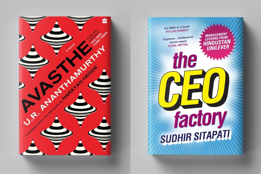
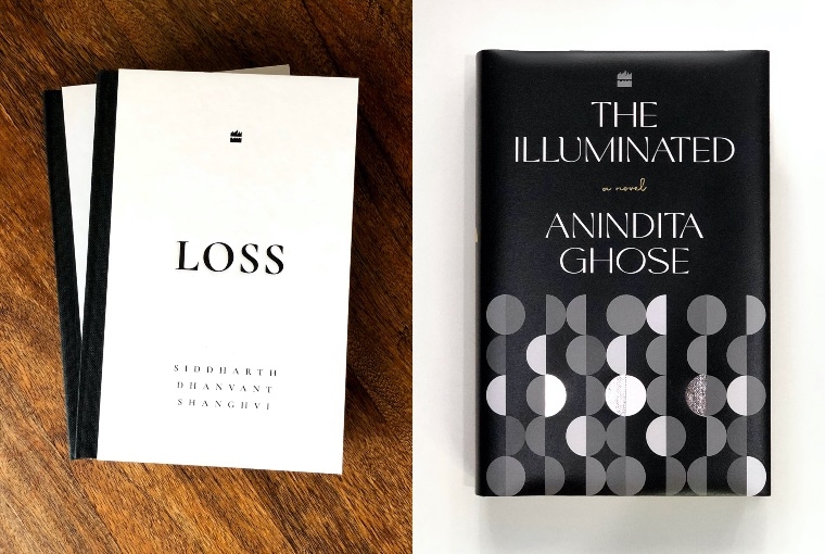
My most recent work on the covers for The Illuminated by Anindita Ghose, Pha(bu)llus by Alka Pande, Loss by Siddharth Dhanvant Shanghvi (for its austere aesthetic and superior production), and CEO Factory by Sudhir Sitapati. I love the cover of A Mirror Made of Rain designed by Rashmi Gupta and The Tiananmen Square by my supremely talented colleague Saurav Das. From our illustrated list, for the meditative quality of the art in Olivia’s Fraser The Journey Within (which was runner-up for the Publishing Next Illustrated Book of the Year 2020) and Sooni Taraporevala’s tribute to Bombay in Home in the City 1977-2017.

The Creative Process
It starts with a cover brief from the editor in charge — some tend to be precise and exacting, others abstract and conceptual. In the case of Avasthe, a translation of the 1970s Kannada novel by U.R. Ananthamurthy that goes by the same name, the synopsis was very compelling, and although the editor Rahul Soni was clear that the last scene in the book (one with a spinning top) was a strong visual representation of the book, I didn’t grasp its true nature or intent until I read the manuscript. We had several conversations during the course of work to discuss other possibilities and landscapes that could make for a striking cover. The cover directions played largely with the dizzying theme of the book, and another that was completely different that depicted a dream sequence with parrots. Given the social and political subject, I felt that a Soviet propaganda-inspired typography and colour palette and a repeat op-art top, best reflected the ideology of the narrative, and the editor and the majority of the stakeholders felt strongly about this too.
The Publishing Industry
Publishing is one of the oldest industries that still holds up in the printed form while evolving into digital and other formats. In the last year and a half, a significant portion of book sales were on digital platforms and the tactility of the printed book became almost irrelevant at the point of purchase. We had to make the physical form of the book known to the reader — book trailers, book mock-ups helped fill in the gaps. Knowing that a potential reader will engage only with a thumbnail image of the book meant we had to raise the bar to adapt to what was perceivable over a phone screen. Cover reveals on social media are the rage and we’ve started an Instagram handle — HarperDesignIn — for conversations around our design process: what works, what doesn’t and why.
The Future
I’m working towards the launch of the HarperDesign imprint, a dedicated space for art and design, society and culture. We’ll be publishing not only visual books under this imprint but also presenting a platform for emerging voices from the creative community that is committed to the documentation and discourse of art and design practice, and its relevance in the Indian subcontinent and in shaping the future. We look forward to publishing the finest in the field. I am delighted to be working with the extremely gifted Namrita Bachchan on her first illustrated book, that transcends age groups and genres, an ode to the power of poetry, told through rhythm and set against the magical backdrop of nature. Also in the line-up is a co-publication with the Bhau Daji Lad Museum (formerly the V&A). Intensively researched and edited by the director, Tasneem Zakaria Mehta, this elegantly designed keepsake chronicles the making of a city through 101 definitive objects in the museum’s collection.
Another book I’m excited about is by the brothers Ayaz and Zameer Basrai on the finest spaces in hospitality in post-liberalisation India. Having conceived and conceptualized some of the best restaurant experiences, such as the Bombay Canteen and Blue Frog, and having worked with some of the pioneers in the industry, their list includes some of the most innovative and well-designed dining adventures. Then there’s a very unique book on design philosophy in education authored by Kiran Bir Sethi, who set up the Riverside School in Ahmedabad, best known for its user-centred curriculum framework. This book unpacks the methodology through the school’s journey, anecdotes, testimonies and multiple design toolkits for empowering educators and influencing pedagogical practice.
There’s much uncharted territory to be explored, and we hope to do so one book at a time.
Text Nidhi Verma
Date 29-07-2021