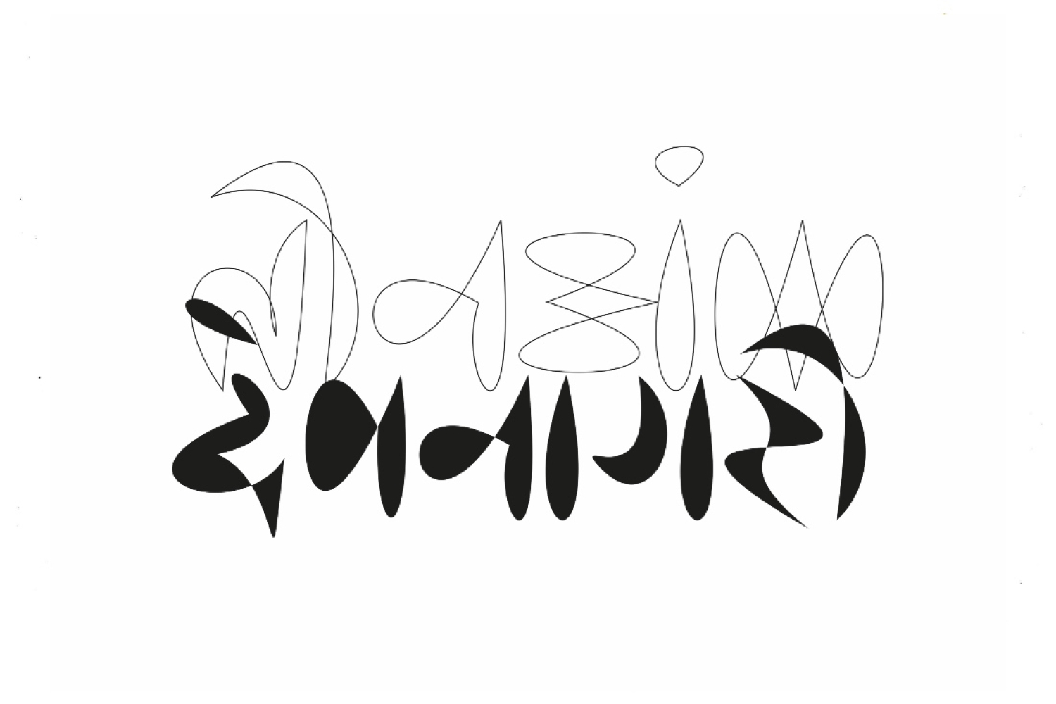
Teenank

Teenank
Type designer Lipi Raval was raised by parents whose professional background helped her develop a keen interest for varied art forms, design and architecture. Already visually inclined as she entered her teens, the artist found herself leaning towards art and journaling as a means of expression. Her interest in type design emerged seemingly all at once, but in retrospect, she tells me it always had a strong presence in her life. She decided to intern at a type foundry and leave her illustrations and doodles as something only for her own consumption, untainted by commerciality.
She tells us all about her practice and process below:
The Practice
I realised around the age of nineteen or twenty that I actively avoided buying locally produced packaged products, which was a real shame as they were yummy! I’d eat them of course, when made fresh or served outside the pack. Living in a hostel, Pune’s Budhani wafers’ irresistible crisps changed this for me, and I tried to examine why I hadn’t allowed myself the joy of local snacks — it came down to the packaging! Local small businesses in the packaged food industry often used two colour printing on very thin and cheap plastic with broken Indic fonts. Nothing about it tempted me to pick it off the shelves, or gave me any assurance that it was safe to consume. I could understand how business models cut costs by using cheaper materials, printing methods, et cetera, but why were they choosing to use such terrible fonts? It was the lack of choice and access to high quality digital fonts.
The Process
It depends on the brief really, and the kind of project. The collaborative or personal project process is slower, it brews and brews for months or years and sees a lot more rebellion. For example, for Ikat, it involved everything, from picking out fabrics for my own clothes, learning the basics of textile weaving, visiting the Patan museum to learn about double ikat weaving, learning more about ikats around the globe, studying 1bit games and graphics, researching LED signs, playing with fuse beads, collating flower motifs found in Indian woven textiles, and in trajva tattoos — the list goes on! Some of my best life and design decisions have stemmed from 'why not?'
For client projects, the process is more structured, more time spent on fleshing out a brief, and then more targeted explorations. I enjoy both processes and like my calendar to have a balanced mix.
The Future
Ikat version 0.1 releases on fourth October on futurefonts.xyz! and long walks with my dog, Roo.
Text Unnati Saini
Date 01-09-2022