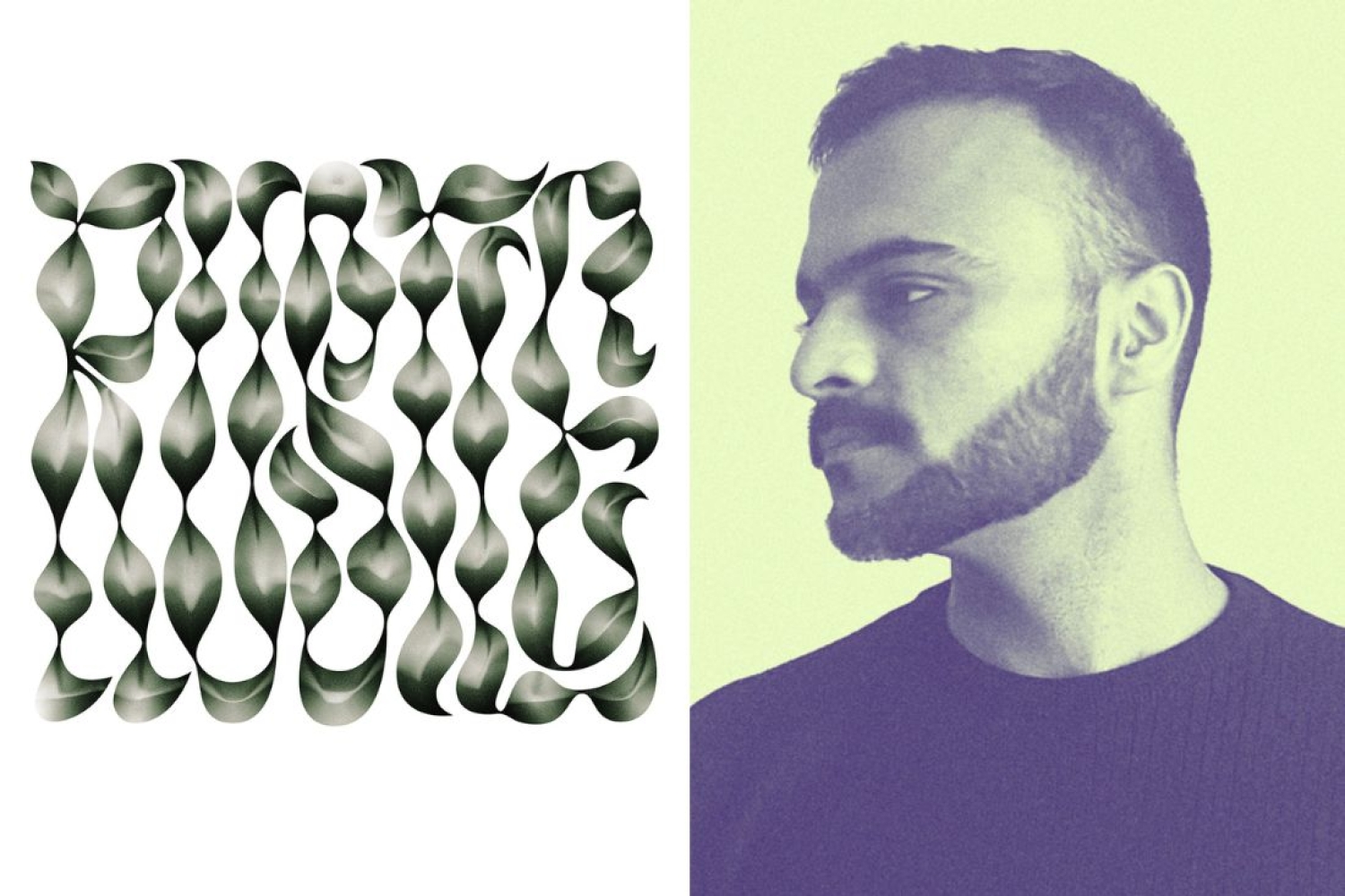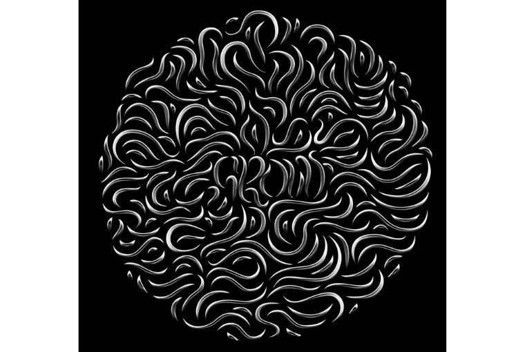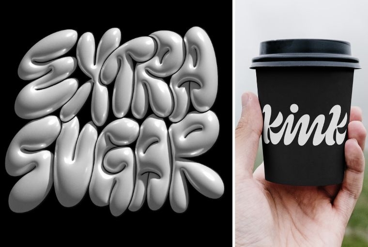

Based in Germany, Pragun Agarwal is an Indian graphic designer who is currently working as a Design Director at Landor & Fitch. Beyond his professional role, he enjoys exploring typography through different styles and mediums. He explains, “I appreciate typography because it allows me to view craftsmanship from a communicative perspective. Using letters, I can convey powerful messages. So, my approach involves more than just putting down words; it's about transmitting emotions through texture, style, or medium. This mindset continues to shape my personal creative efforts.”
Design Philosophy
My design philosophy revolves around infusing emotion into typography. I achieve this by playing with materials and styles. For instance, I've delved into experimental projects involving food, where I translate the essence of the food into the typography itself. Furthermore, adhering strictly to a single style can be restrictive. One of my philosophy is to constantly challenge that. Researching, trying new tools or styles is how I am able to expand my knowledge and and also come up with interesting visual outcomes.
Inspirations
Speaking of typography, one of my initial influences was Satyajit Ray. While renowned for his films, his typography and title designs stood out remarkably. The essence, style, and the sheer confidence of his work were truly inspirational. Other than that designers such as Sanchit Sawaria, James Edmondson and Type Foundries like Sharp Type & Grilli Type are some names that come to mind. Drawing inspiration from this circle adds to the richness to my creative journey.

Creativity with Functionality
In typography, functionality primarily revolves around legibility and readability — ensuring the text is clear and easy to read. When in doubt, I often seek the perspective of someone older, as it offers a valuable point of view. Simultaneously, I enjoy experimenting within the realm of legibility and ambiguity. This involves treating typography as an interpretive art piece, blurring the lines between clear and unclear. It's a delicate balance I strive to achieve.
Advancements in Technology and Design Tools
I am sure that sooner than later, you can create a font with AI. I think artificial intelligence space is there to stay and people will have probably custom fonts. Everyone can make thousand custom fonts a day but I think what is quite integral to typography is that you have a piece of paper and it's your handwriting. You have some level of ownership about how you would write and I don't think technology can take that away. If we expand on this notion and build upon the foundation of our individual handwriting or sketches, we can still have a great deal of personality and ownership.
The Future
I want to continue to integrate technology, AI and other digital applications at our disposal into my personal work. I find it intriguing to go beyond practical uses and understand how it will be possible to even discover new aesthetics and styles with these tools. This challenge will be a big part of my upcoming work. I don't have specific plans yet, but I look forward to seeing where this approach takes me.

Words Paridhi Badgotri
Date 22.08.2023