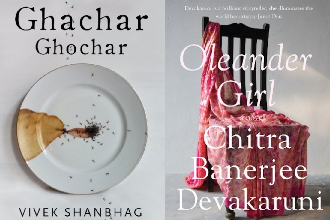

Editorial designer, Bhavi Mehta, lends us some insight into her design sensibility and the making of book covers.
The Designer
I was a child who was always drawing. Growing up, art education was never a big part of the curriculum in Army Public schools. Also, living in remote towns, we didn’t have exposure to new media. My mother would find an art class for me, wherever we moved, and we moved a lot. I remember my dad writing us long letters filled with stick figures and clippings of his favorite cartoon strips. He always had a creative side and encouraged our creative pursuits no matter how frivolous. It wasn’t until high school that I found out about graphic design. The design program at NIFT opened up a whole different world, it was a very exciting time and I absorbed everything I could get my hands on — old Communication Arts and Vogue Italia issues, art catalogues, books on poster design, the list is endless. I had a fantastic professor named Renee Kaur who taught us graphic design. She nudged me towards a design internship at Penguin Books, which then led to my first design job in book publishing. I had always been a reader, now I could read and design books, I loved it.
Editorial Design
A good book cover for me is a memorable one. If I can remember a book by its jacket, then it’s done its job and more. It’s a part of you in a way and I think that is very special. Personally, I think good design leads to more good design, what we see around us shapes our visual aesthetic. As a designer I feel a certain responsibility to create meaningful work, it’s important to think about what you are putting out there for people to consume.
Design and Art
I think design is a way to solve problems and art is a reflection of the times we live in. As a designer, I sometimes find myself leaning on the vision/expression of artists to convey an idea. For example, I used a stained dinner plate crawling with ants from this creepily enchanting series of tableware by a German artist named Evelyn Bracklow for the cover of Ghachar Ghochar for Harper Collins. It just clicked. For Chitra Banerjee Divakaruni’s Oleander Girl, I used a piece from Bharti Kher. I also feel art is becoming more and more accessible now, thanks to Instagram accounts like Arts of Hindostan, who are bringing art to our daily feeds.
Influences and Inspiration
Paul Rand, Milton Glaser, Massimo Vignelli, Alvin Lustig, Louise Fili, Neville Brody, Jonathan Barnbrook, Paula Scher, Geoffrey Bawa are some of the designers I am hugely inspired by. With regards to contemporary book designers, I admire the work of John Gall, Peter Mendelsund, David Pearson, Helen Yentus to name a few.
My inspiration usually comes from the particular book or project I am working on — I try to keep an open mind, do my research and let the work communicate what it wants to be. For outside inspiration I look at exhibitions, art shows, local art and craft forms, flea markets, antique stores, food shows, films, music. Traveling and surrounding myself with like-minded people is definitely a constant source of inspiration.
Favourite Book Covers
There are so many of them, it’s very hard to pick favourites. But if I had to choose a few they will be: Notes from a Fog, designed by Jamie Keenan, It’s like nothing I have seen before. The reversed type, that photograph — just brilliant. The Frolic of the Beasts designed by John Gall. Book cover, collage or a work of art? I say all of it. Helen Yentus’s series work for Camus is my all-time favourite. Helen makes black and white jackets come to life.
The Creative Process
I recently worked on the cover for Desi Delicacies by Claire Chambers for Picador India. The book is an anthology of food writing exploring Muslim history and culture across South Asia. It’s a collection of charming essays by well-known authors mainly from India, Pakistan and Bangladesh. The brief came with a few suggestions such as pictographic representation of a dish/ingredient or a typographic approach with an element from the book. The main idea was to not treat this book as a cookbook, even though each essay concludes with a recipe, but instead as a book of literary narrative food writing. As I read through the manuscript, I narrowed down the major themes of the book — food of course, history and a deep sense of nostalgia. I started looking for objects from kitchens across India and Pakistan — old utensils, crockery, patterns from old tablecloths, forgotten ingredients like black carrots that make a cameo in the book. These were some of my initial drafts:
The kettle was shortlisted, however, we decided to explore some more options for the book. While doing my research, I had come across beautifully illustrated pages from the Nimatnamah (‘Book of Delights’), which was commissioned in the 15th century by Sultan Ghiyath Shah, ruler of Malwa. The manuscript is written in Urdu and Farsi and is illustrated with 50 miniatures. Even though there is no mention of the Nimatnamah in the book, it ticked all the boxes. It was decided unanimously to go with the following illustration that depicts a feast in progress. Once the imagery was in place, I explored different type treatments to compliment the illustration, finally we decided to go with a classic title treatment. The editor was very keen to have all the contributor names listed on the front, so I decided to use a calligraphic script typeface to wrap their names around the illustration.
The Publishing Industry
I think it’s a very exciting time — instead of talking about ebooks replacing physical books we should be talking about how to make the most of the different mediums/formats available to us. I think publishers need to think about reimagining covers and book layouts for electronic books. A design that works in a physical format may not work as a thumbnail and vice versa. For example, there is a current trend of using very large type because of the concern of how a cover will read online at a thumbnail size. The problem with this trend is it does not necessarily look as nice on its printed counterpart. Perhaps thumbnail covers don’t need to carry the title and author name as they appear alongside anyway, they can be treated as logos or icons with just bold imagery, or maybe ebooks can have memorable book trailers like movies. Just a thought. The only problem I see is that unlike a physical book, there is very little interaction between the reader and the cover in an electronic format. I think we need to find ways to overcome that.
The Future
A speculative fiction novel by Anil Menon, a logo for a gaming studio and a personal project on Ramayana in 80 frames.
Text Nidhi Verma
Date 19-07-2021