
Quirky, minimalist, colorful, collage-like — every book cover has its own personality. But a book cover does more than just propel a reader to pick a certain book, it is a silent witness of the changing understanding of the reader and the emotional and intellectual journey they undertake with the book. It explores and accentuates both the conspicuous and obscure themes of the book through the unique vision of the designer, their creativity and precision.
For Ishan Khosla, the winner of the Oxford Bookstore Book Cover Prize 2022, a great book cover not only grabs your attention but brings out something new and hidden after you’ve read the book and look at it again. The visual artist and designer grew up in a house surrounded by art and design as his mother was in advertising. Pablo Bartholomew and a lot of other well-known photographers would be home when he would come back from school. We talked to him to know more about his design practice and the Typecraft Initiative, which he co-founded in 2012. Excerpts follow:
Tell me more about the idea behind the book cover for Kintsugi.
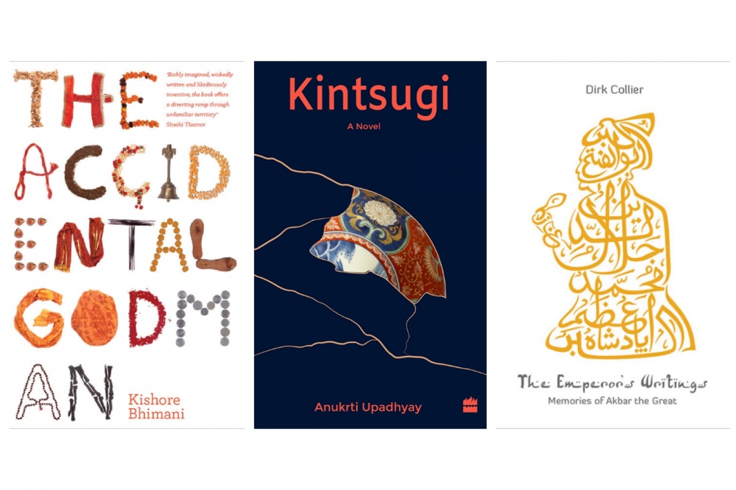
The book is based on the idea of fragility of humans. It’s very emotional in many ways, very well written by Anukrti Upadhyay. So, for the cover design I began exploring all sorts of ideas, intersecting where the characters were from and the places they were traveling to, like Jaipur and Japan. In the final cover, it was more about representing Kintsugi more directly, an art form used to mend broken ceramics which can also be seen as a metaphor for mending broken relationships or repairing your life.
What does the process of designing a book cover look like?
The process is always, first of all, getting a basic understanding from the publishers, reading the book or a part of the book, and if possible, speaking to the author. Trying to understand who’s the book for, what the book is really about, what are the emotions that need to come out and if there are some metaphors, is integral to the process.
What are some of the most remarkable book covers you’ve worked on?
I really enjoyed working on the cover of The Accidental Godman for which we made a typography out of the various objects a godman carries like ‘mauli’, ‘chappal’, et cetera. Another very interesting and challenging cover was for The Emperor’s Writings where we used Islamic calligraphy to write ‘The Emperor’s Writings’.
How did the Typecraft Initiative begin? What was the inspiration behind it?
Back in 2004, I was in America working on my masters’ thesis, which was on design education in India, when it struck me that there isn’t really anything Indian about the typography we see everywhere. So, I started experimenting with objects like jalebi, dupatta and letters. Over time, when I moved back to India, I started working on book covers, posters and tried to work with local communities and artists like the ‘mehendiwallas’ as well. Initially it was just lettering but around 2011, I began thinking of making a font, a typeface, with Indian crafts including the tribal arts, as a digital file which anyone can download and use on their computers unlike lettering which is used for a specific purpose and can only be used once.
So, the vision behind the Typecraft Initiative was twofold. Firstly, creating a dialogue with rural audiences since, if you’re a textile designer, you are already traveling to villages or the local communities and engaging with artisans but you don’t tend to deal with people of different communities if you’re a graphic designer. And secondly, I wanted to make a typeface that is something more long lasting than just lettering, beneficial not only to the person using it but also to that community.
Could you walk me through the latest Typecraft project, Barmer Katab.
For Barmer Katab, we worked with an NGO based in Delhi, Rangasutra, which is owned and run by the artisans themselves. We did a workshop with about twenty craftswomen in Barmer just before Covid. Our workshops are basically very open ended and collaborative, by which I mean it gives someone a safe space to learn and to fail. Usually artisans are given the design and they have to make it, but here at Typecraft, we try to involve them in the process of design itself. So, there’s a lot of ownership and authorship. It’s very challenging for most people to make their font, they are used to making certain motifs like a peacock or a tree form but it’s quite difficult to take that motif and make that into different letters. It was a step-by-step process where we started with paper and they did their own cutting. A lot of facilitation and guidance is given by us but we also try to learn a lot from them about their community and the meaning of the different motifs. Finally, when they created the entire alphabet, we scanned it, vectorised it and brought it into a software called Glyph where we develop the typeface. So, the whole process took more than a year.
What are you working on currently? How do you plan to take the Typecraft Initiative forward?
Currently, we are doing a Madhubani based typeface, Mithila, working with the craftspeople from the Madhubani region of Bihar. We’re doing it in Hindi this time, which further complicates it because unlike English where you’d have a maximum of 40 to 50 characters, in Hindi we have about 200 to 250, including the vowel diacritics. The next project we are looking at is to work with the Warli community in Maharashtra. We haven’t decided yet if we’ll do it in English or Marathi, or both, but whatever we do, I want it to be more conceptual than just a letter form. So we’re trying something more experimental this time, to bring forth a deeper message which comes out subliminally through the design.
Text Saumya Singh
Date 08-04-2022