Thesis

Thesis
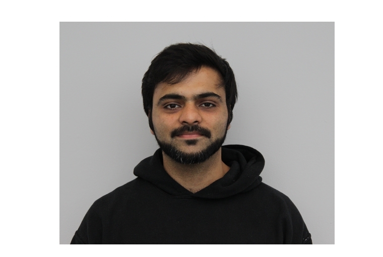
Pragun Agarwal’s work is starkly reflective of everyday elements. Picking words that we interact with habitually, he looks to reinterpret them visually by experimenting with different materials, textures and tools. In conversation with the typography artist, as he delves into his journey, artistry and sensibility.
The Artist
Pragun Agarwal was born and brought up in Delhi. After having done his schooling in the capital city, he pursued Graphic Design at National Institute for Design in Ahmedabad. Shuttling between jobs and internships over the next few years, he went on to do a Masters program in Graphic Design itself, at Maryland Institute College of Art in Baltimore. He tells me more about his ties with the field, 'Instead of diversifying, my philosophy is to pursue something and really nail it down.Typography is a subset of graphic design, and some of the skill sets that are a very integral part of my portfolio are my personal practice. What I do nine to five, and what I do after that is very different. Very few times do the practices marry and you're able to do what you do as a personal practice in a commercial atmosphere. Typography has always been for myself, for my own inspiration, growth and fun.'
The artist recently started working as a senior designer at Landor, and is currently settled in Germany. 'I’ve always wanted to experience Germany because it's sort of the birthplace of so many things about typography, calligraphy and graphic design. So for me, it is a cultural shift, but something I’d love to embrace. Since 2010 I’ve just been travelling and it has kept me going,’ he adds.
The Journey
The artist reminisces his encounters with typography and his rendezvous with calligraphy, at an early age, 'Interestingly my father has a very good hand and he has a knack for calligraphy, so I probably got it from him. I've always seen him, even when writing my fee cheques and other things, he had such good control over characters, but I never was able to translate it. I had a decent handwriting in school, but my father’s understanding of type was always there.' Later, during his stint in NID, Pragun got introduced to typography in his second year as a foundational course. 'I went into graphic design thinking this is just illustrations. I did not realise how integral typography is to graphic design. And when we had our first class in type design, I realised that graphic design is mostly typography. That was my first introduction to letterforms, understanding the anatomy, and especially calligraphy,’ he elucidates.
However, it wasn't until a few projects into his new job post his graduation, that Pragun started introspecting about his sensibility, and what it is that he brings to the table as an artist. 'When I started doing the job, is when I questioned, what is my personality in a particular team project? How do I present it to the world? So that was my first driver, because there was a vacancy. I had to do something that I can call my own, you know. That’s when I started pushing myself,’ he shares. Thus began his journey with calligraphy, meandering through analogue aesthetics, eccentric materials and evocative textures.
He takes me through this journey of first gaining mastery over calligraphy, 'I did not have any formal knowledge of calligraphy. And that time, there weren't any active references or tutorials. Now it's become a trend, of sorts. And at that time, my mom had travelled to Japan and brought me those brush pens, which are very commonly available now but at that time weren’t in India. And I liked the feel of it and the whole idea of it. I asked a senior of mine how do I go ahead and letter with this. We all are accustomed to lettering with the chisel pen, but a brush pen was something new. He asked me to think about the contrast, the thick and thin, understand the feel of it. And that was it, that was my training in calligraphy!’
The Practice
Speaking about his routine and inventive practice exercises, he tells me, 'I learnt through a lot of tutorials. I had this habit of coming back from work, and watching something on T.V., usually football. I would start doing calligraphy of all the commentary as practice, and fill notebooks and notebooks of it. As designers you struggle with what to write, and at that time, when you want to practice, you shouldn't think so much. Just fill books and books. I realised that the more I was doing this, the more I was getting better at design in general, even digitally. I was understanding counter-spaces, I was understanding balance and contrast. And all of these things, I could translate into my daily job as well.'
Pragun Agarwal started out with brush pens, then slowly got familiar with chisel pens and later, digital typography as well. However, his affinity towards handwritten, analogue artwork has remained constant over the years. 'I think we live in a world where we’re surrounded by 3D technology and aesthetics. And I'm all for it. It's extremely difficult and I have extreme respect for those who do it. But there is something about analogue work that is so true to what you do. It really is very unique. Something that you do with your hand is just yours, no one else can replicate it,’ he adds.
The Toast Guy
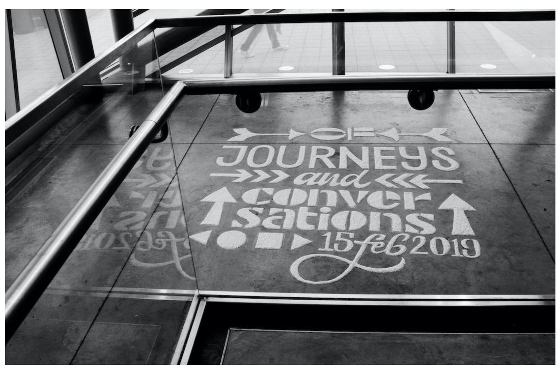
Toast was one of his biggest projects at MICA, where the artist invited seven artists from different cities to celebrate diversity. Delving into its details, he tells me, 'Coming from India, we have a very strong affinity towards festivals, and I wanted to celebrate that. And also experiential design, which for me, was about how you can get people in one space and make them feel and learn and interact, the same way they do in a book or on a website. So for my written submission, I wrote about how experiences are more rewarding than objects at times. All the people spoke at the festival, did not speak about fancy design projects but about their journeys from home. How they translated what they learnt in Lebanon or China into graphic design in the U.S., and how culture is a very essential part of their practice. And I was quite successful I believe, and soon people started saying to me, ‘Oh, you’re the toast guy!'
In this way, Pragun Agarwal crafted his own design festival for his thesis project. But why call it ‘Toast’? When asked about the intention and thought behind such a seemingly prosaic title, he tells me, 'I called it Toast because of course to toast is to celebrate, and also toast, the food item that people have across the world in different ways. So initially I crafted letters from toast and used different ingredients, and I was just trying to explore how it might feel like. But I felt it was too literal. So instead, what I ended up doing was, I took half a toast and dipped it in ink and made letterforms with it. I also made a typeface around it. It leaves a stroke that signifies the idea of a journey, of a path. It was essential to my festival.'
The Creative Process
The typography artist deep dives into the creative process behind his work, 'I think of the word first. Every time I’m writing anything, I'm always trying to think about what it feels like. My mom is a home chef so I'm always surrounded by food because she's cooking for clients. So a lot of my typography work revolves around food, which is a direct influence. I write these words down, but when I write them, I don't want to just write in a beautiful way. I want to convey an emotion to it, and that's very essential to how I approach typography. Typography is more of a personal channel, where I push myself, experiment, express. A lot of ideas are very intuitive. I work on these over the weekends. They come to me naturally and I want to explore and try things out.'
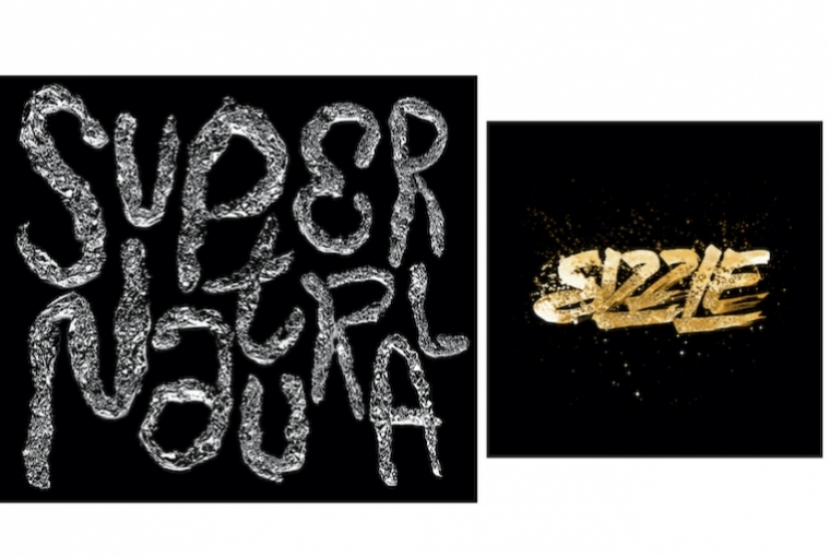
'Of late, I've been experimenting with a lot of digital stuff. I use the blend tool on Illustrator, which I find to be very interesting. It's a mix of analogue and digital, as I always draw the letterforms first, and then letterize them on Illustrator, and then I apply the effects. I always try to push 2D material into looking 3D, through analogue handmade experiments,’ he adds.

L: Lettering ; R: Appetype
The Inspiration
'I'm a big fan of Satyajith Ray's graphic design work. It's absolutely phenomenal, there's a book on it as well. And it's absolutely brilliant, the way he was able to do type design even in Bengali. So that's something that stood out for me. Then there is another Dutch artist called Job Wouters. These are two people who I always think of, as an inspiration,’ he says. But in terms of personal inspiration, the artist has always loved the originality behind the vast creative potential of quotidian elements. 'When I'm walking home from work, I'm probably observing some textures or some small details, and it subconsciously translates into what I do. So right now it's humid and rainy, and I would think of something relevant to that. I recently did one on the rains and on pollen. At least for my personal work, I try to stay away from Pinterest or any kind of design inspiration. In a commercial atmosphere, you sometimes have to fall prey to it but for my personal work, it's a strict no-no. I genuinely try to be inspired by what I see around me and develop new ideas, and I think I'm trying to do that with my work. Like yes, the whole world is going 3D, and I'm still a lone flag bearer for analogue work. I think it's evolving into my own personality in that way.'
The Pandemic and Beyond
'Graphic design is possible because it is not a very physical labour of sorts. It is possible to do remotely, and I have comfortably adapted to this. 20-30 years back, it would've been impossible because at that time graphic design was a very analogue process, people were measuring things by scales and rulers, so it was a very analogue driven world. However now, since everything is digital, it has been quite a smooth transition. I feel like post the pandemic, the working environment might become optional, where this type of system becomes more flexible, in terms of graphic design,’ says Pragun.
When asked about his future plans regarding typography, he says 'I think I’m very young, in terms of my design career. A lot of people feel comfortable to have their own practice at a certain age but I still want to learn more, figure out what I stand for, what I believe in. This will always continue on the side. But eventually when I do have my practice, I would want this to be a part of how I portray myself to the world. That typography is central to my process and so is experimentation and analogue work — these are all the things that I stand by.'

Pragun Agarwal