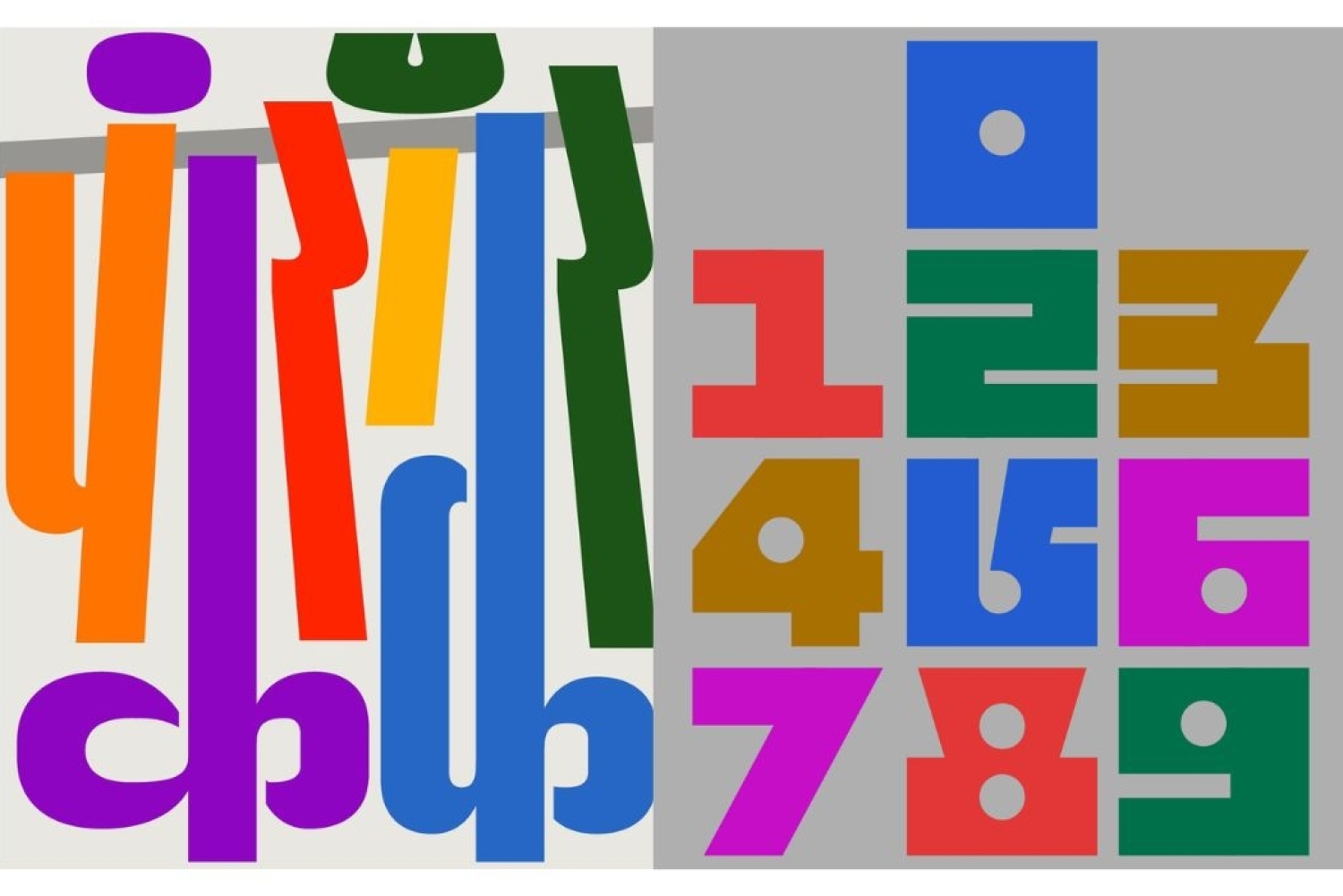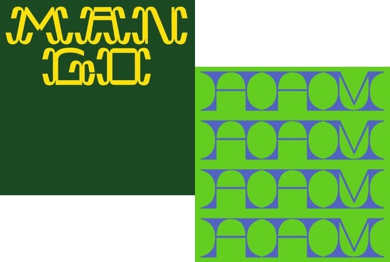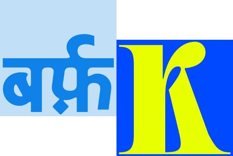

If one encounters Manav Dhiman’s work for the first time, it is usually colour that arrives first. His compositions often feature saturated hues that push against each other with intent, creating bold typographic forms that fill the frame with bursting energy. Large Devanagari letters can sometimes stretch and curve into sculptural shapes in a manner that feels both familiar and entirely new. At the same time, numerals can also become blocky, playful structures situated in rhythmic patterns. There is a range to his practice: some consist of repeating arcs and angles that form architectural grids, while in others, a single word becomes an emblem in and of itself.
Across these variations, the throughline is clear. Manav’s design typography is a visual language that can change mood, pace, and personality with proportion and colour. There is a certain sense of joy and experimentation that permeates his work, rooted in a belief that language, and thereby letters, exist outside their confined space of static symbols. They are treated as living forms to be reinvented. This innovative playfulness is what marks his practice apart. He spoke to us about what sparked his interest in typography, what inspires him, and how he builds his process.
The Beginning
Manav’s relationship with type began long before he formally studied design. As he puts it, ‘I first started being interested in typography way back when I was in school. I used to make notes on MS Word and try to match the typography to my textbooks and match the fonts as closely as possible.’ This small act of observation opened up an entire world.
‘That led me down the path of discovering that everything that we see is designed by someone, like the fonts (hand-drawn too!), UI, the layouts in my textbooks, etc. And then I discovered you could go to college and study design.’ These early moments formed the foundation of his creative life. They also shaped the way he sees design today as something always present and always intentional.

Finding Inspiration in the Everyday
For Manav, inspiration is something that joins him in his everyday life rather than something sought elsewhere. ‘Inspiration is everywhere I see. Sometimes it is the type on the back of a bus, or on an old electricity box, or some lettering in a film I am watching, etc.’ What interests him is the possibility of surprise. ‘I like the craft of letter design and doing something unexpected through that. I enjoy the process of having fun with familiar forms that we all have all around us.’
This also applies to his work with various brands, where both familiarity and distinctiveness are equally important. ‘For brands, specifically, it is about creating something unique, something they can be remembered for. It is also about adding something fun to a part of brand design that might not usually have that in it.’
Motivation Behind Using Bright Colours
Colour plays a strong role in his work and his interest in it is intuitive. ‘I just enjoy the idea of using colours that are unique and not used much. I enjoy pushing myself to find specific colours and shades, match them and use them together. Sometimes, the motivation is that I just like them.’ There is no overthinking here, only instinct and a willingness to follow it. His combinations feel unexpected because they are rooted in what excites him visually.

Research Process
Even with the playfulness of his visual language, his process begins with structure. ‘My process always starts with understanding context. Every project is different, so the first step is figuring out whether they even need my involvement and whether I am the right fit for them.’
He explains the selectiveness with care. ‘We are quite selective, not out of arrogance but because we want clients to feel that their investment is genuinely helping their business.’ This means spending time in conversation before any design work begins. ‘So we ask a lot of questions. About their challenges, the industry landscape, the gaps they are trying to fill, and what success looks like for them. The goal is to become long-term partners who support them far beyond the deliverables.’
The Future
Manav remains focused on work that has purpose and clarity. ‘Currently, I am working with a non-profit to bring their valuable research to life so that it can reach more people and make a bigger impact.’ There are also new explorations underway. His future projects stay rooted in the same principles that shaped his beginnings. He continues to look closely, to pay attention to the designed world around him and to find joy in the forms that shape how we read, communicate and recognize meaning.
Words Neeraja Srinivasan
Date 10.2.2026