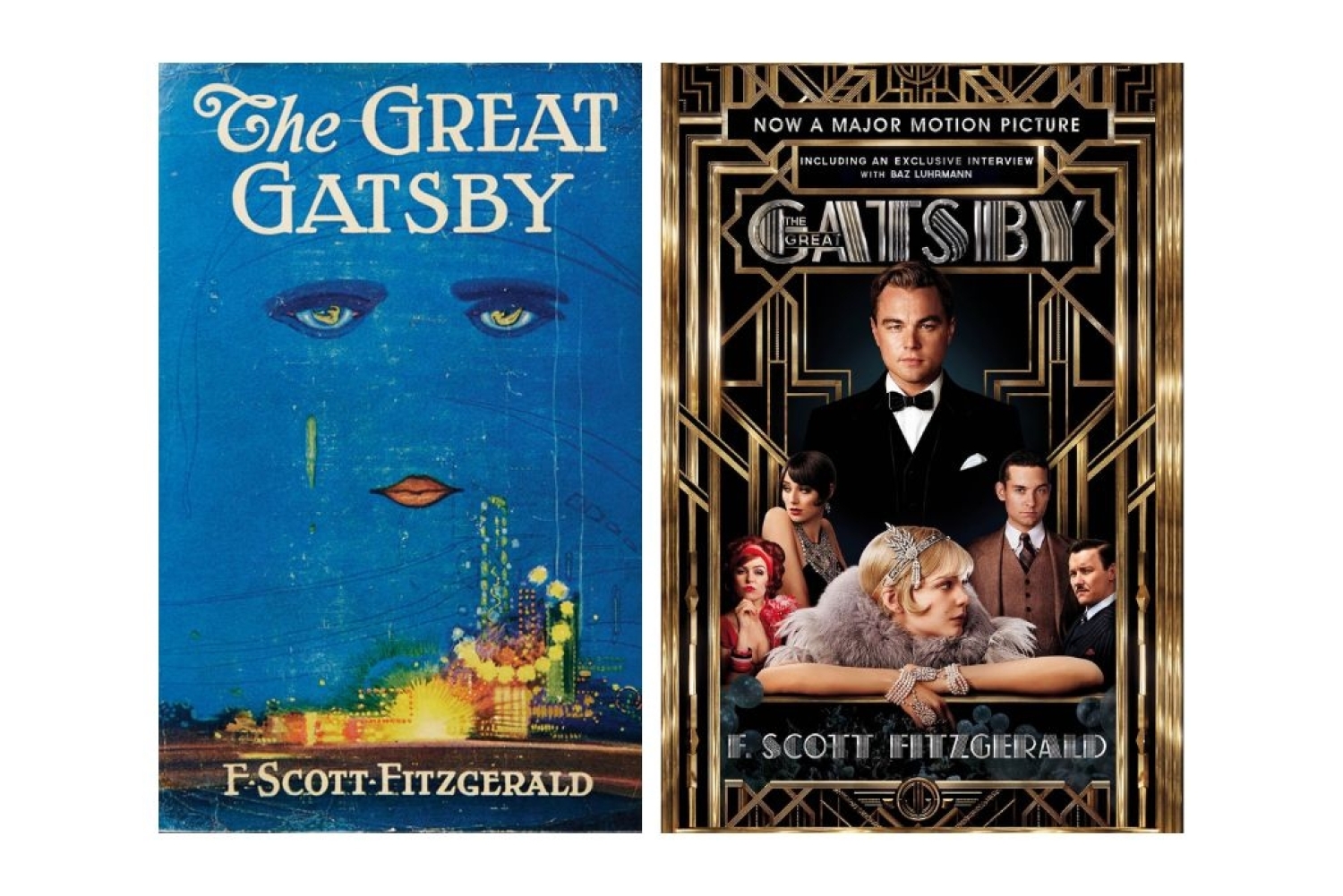

Few books carry as much visual history as F. Scott Fitzgerald’s The Great Gatsby. Every time a designer has returned to it, the novel has taken on a slightly different shape, a new mood, a different understanding of what makes Gatsby so unforgettable. These covers act like time capsules. They show how readers across decades have seen the story, how their ideas of beauty and desire have changed, and how a single novel can keep inspiring fresh interpretations.
The First Edition
The first edition from 1925 remains the most recognisable. Its blue surface and dreamlike imagery gave readers a glimpse of the book’s emotional world rather than its plot. Instead of telling you who Gatsby is, it invites you into the feeling of the era. Almost every later cover either leans into this atmosphere or deliberately tries to break away from it. That is the power of an image that becomes iconic before the novel has even set off on its own journey.
Mid Century
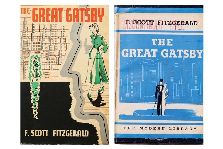
By the mid twentieth century, cover design was changing. One illustrated edition from this time plays with lines and shapes that look almost architectural, a reminder of how quickly cities were changing and how modern life was speeding up. The Modern Library edition from roughly the same period captures a more polished version of this idea. The couple, stylised skyline, and balanced palette all speak to a growing sense of nostalgia.
Photography and Realism
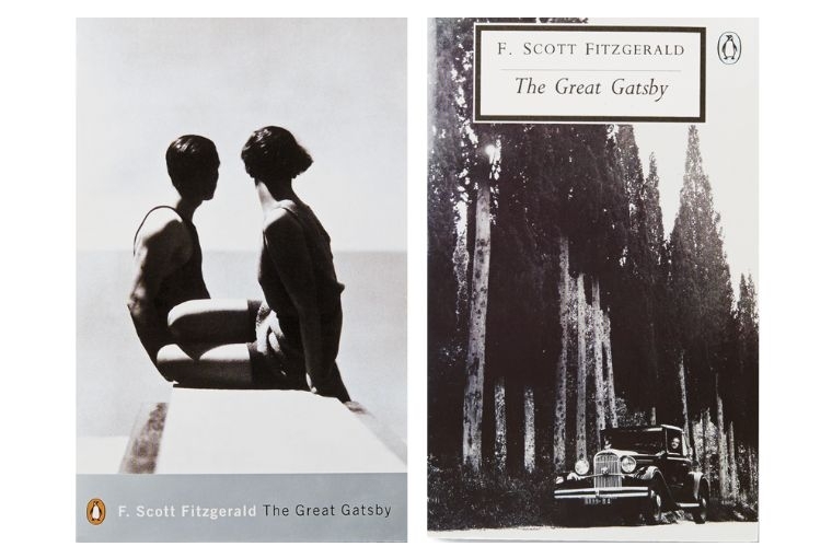
Photography changed book covers in a profound way. Two of the editions here draw heavily on it, and feel more intimate as a result. One shows two figures by the water, caught in a moment of connection, and another shows a vintage car moving through a landscape of trees, which gives the story a sense of motion. These covers do not only try to recreate scenes from the novel. They lean into feeling.
The Age of Illustration
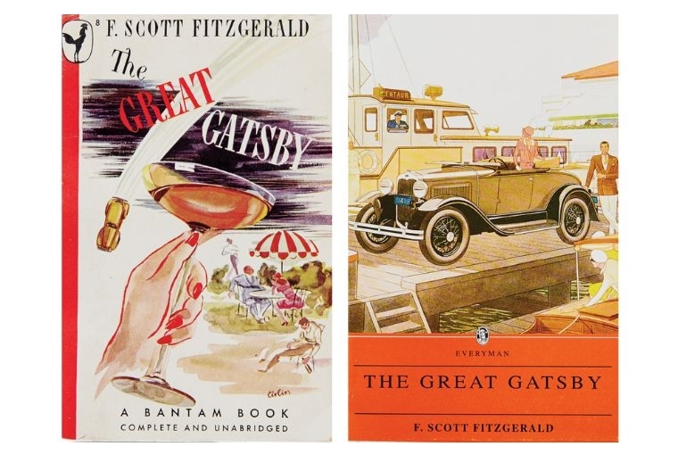
Some covers take a lighter, more colourful approach to Gatsby’s world. The Everyman Library edition brings out the breezy confidence of the period. It invites the reader into a world where summer afternoons feel endless. In another Bantam edition, a raised champagne glass becomes the symbol of the novel’s parties. It has a sense of brightness that reflects the way Gatsby’s gatherings might have looked from the outside: easy to admire without noticing the cracks that lie beneath the surface.
Pop Culture
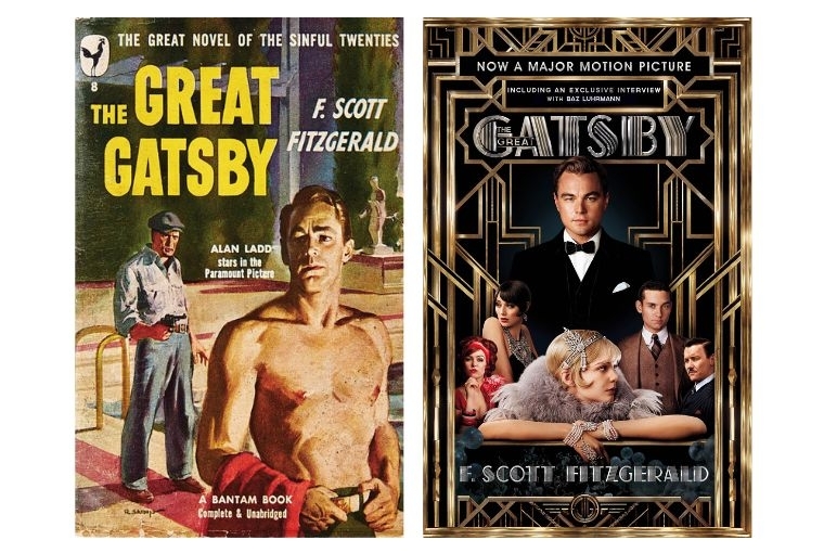
The film cover with Alan Ladd shifts the novel fully into popular culture. It is dramatic and ready for the cinema audience it hoped to attract. This version of Gatsby has sharper edges and higher stakes. The cover reveals how often Gatsby has been asked to play roles beyond the page. And of course, the version of the cover that features Leonardo Di Caprio is almost as iconic as the first ever edition, since well done book to film adaptations are hard to come by. The searing gold, the smirk on his face, and his towering presence represent the ethos of the story perfectly.